Happiness Maps
I created an interactive data visualization in Processing that allows users to explore the happiness levels of Seattle over time, based on data from the Seattle Public Library. Each year is represented as a stacked terrain map, with happiness levels shaping the topography.

I was inspired by the Hedonometer for this project, which is a project out of the Computational Story Lab at the University of Vermont. The Hedonometer takes a random sample of 10% of all tweets everyday and strips them for English words. These words are matched against a list of about 10,000 words with associated happiness ratings between 1-9, with 1 being the saddest and 9 the happiness. The word rankings were averaged from rankings given by Amazon Mechanical Turk workers. In this way, the Hedonometer can get the overall happiness level of Twitter on a given day. This is not based on context at the moment, but purely on the happiness of each individual word. Despite this, the Hedonometer does a pretty good job of capturing the sentiment of a large group of people, and their happiness map has clear inflection points for tragic and joyous events experienced at a large scale.
I was curious if happiness levels could also be detected in checkouts from the Seattle Public Library, and if they would also correspond to large events happening in the United States. My prediction was that mood would not respond as quickly as it did on Twitter to large events, but large events might have a more sustained impact on what titles were being checked out.
The Hedonometer project provides their list of words with happiness rankings as a downloadable CSV. I wrote a simple Python script which, for each date in the data returned by my query, went through each title, looked up its individual words’ happiness rankings, averaged per title and then averaged per day. In this way I was able to get an average happiness ranking per day, and save this into a new CSV. Like the Hedonometer, I ignored some words which are difficult to ascribe a happiness value. I also noticed there was outlier data on days that the library was closed, i.e. holidays. I removed those days from my analysis. From this I generated a line graph of the happiness scores in 2022 for Seattle:

I identified one anomaly--there is no checkout data from 10/2/22 to 11/21/22.
Like the Hedonometer data above, the happiness rankings tend to hover around an average happiness ranking, although book titles are slightly less happy over- all. However, we can still see some trends. On both charts, the final months of the year after Thanksgiving are happier overall. I’ve highlighted some other similarities in responses to significant days that I noticed.
Valentine’s Day is highlighted in yellow, and it does seem like happiness spiked somewhat from previous days.
The mass shooting at Robb Elementary School was on May 24 and is highlighted in green, the chart hits one of it’s lowest points the following day.
On June 24, the Supreme Court overturned Roe v. Wade, which is highlighted in pink. This and the next couple of days mark a downturn in happiness.
Overall, although the range of values was small, there was some real variation in sentiment, some of which may seem to be in response to large events. There also seem to be longer periods of mood shift, such as a sadder spell in the summer and a spike in mood in the winter. I wonder if this may actually reflect the opposite in general mood–perhaps people are actually sadder in the winter, and checking out cheerful books to try to improve their mood.
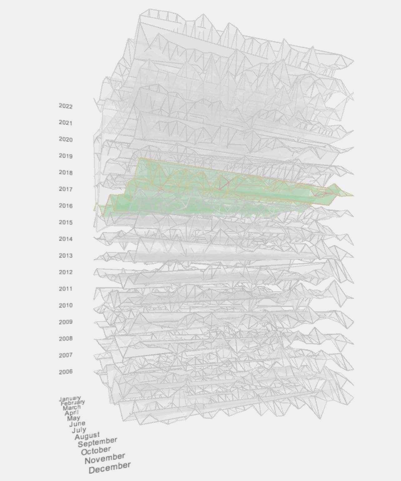
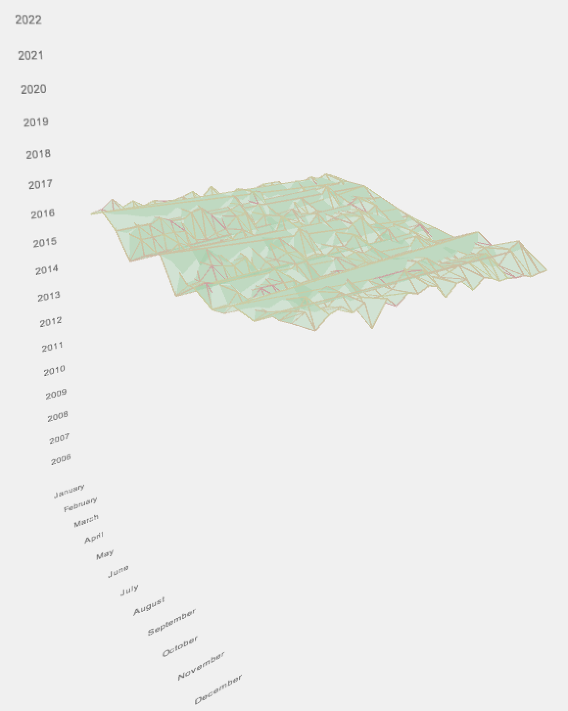
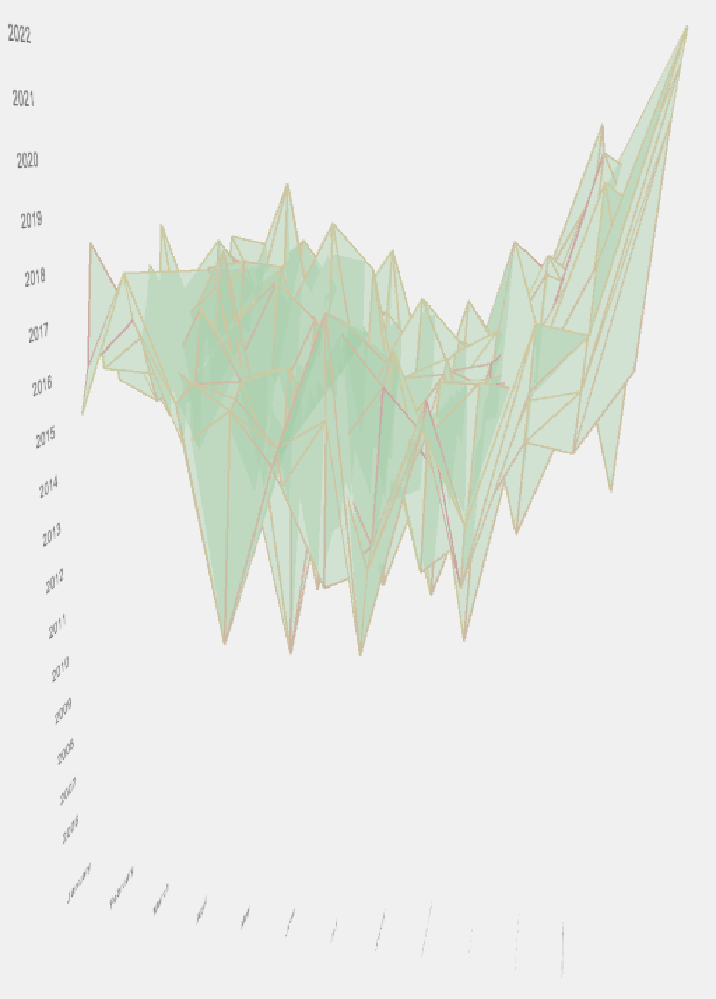
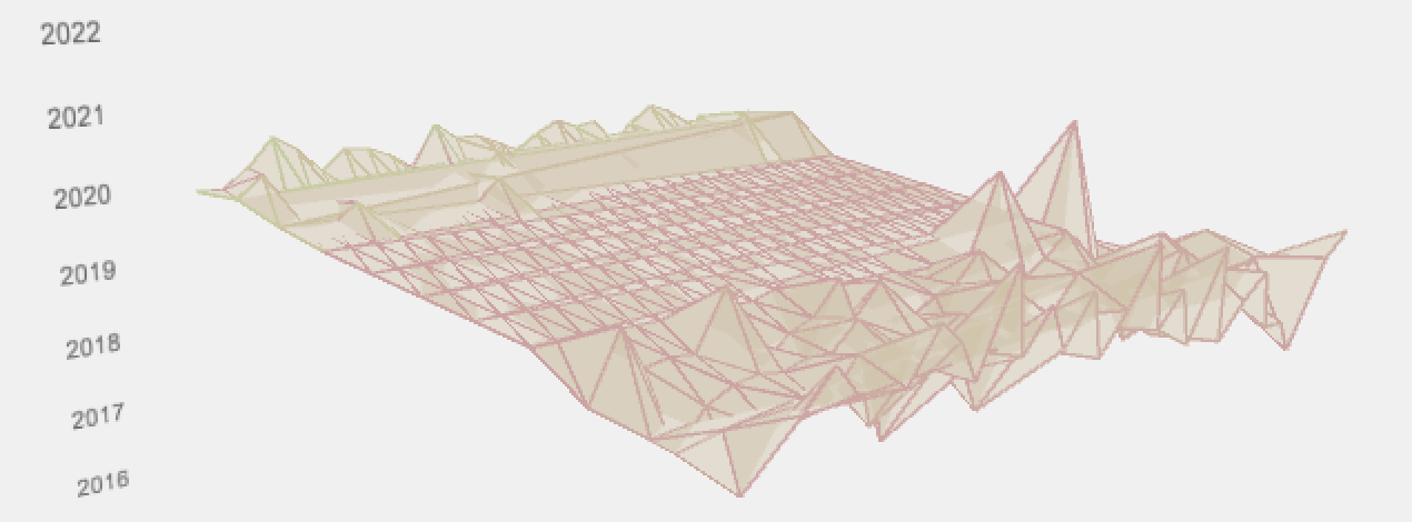
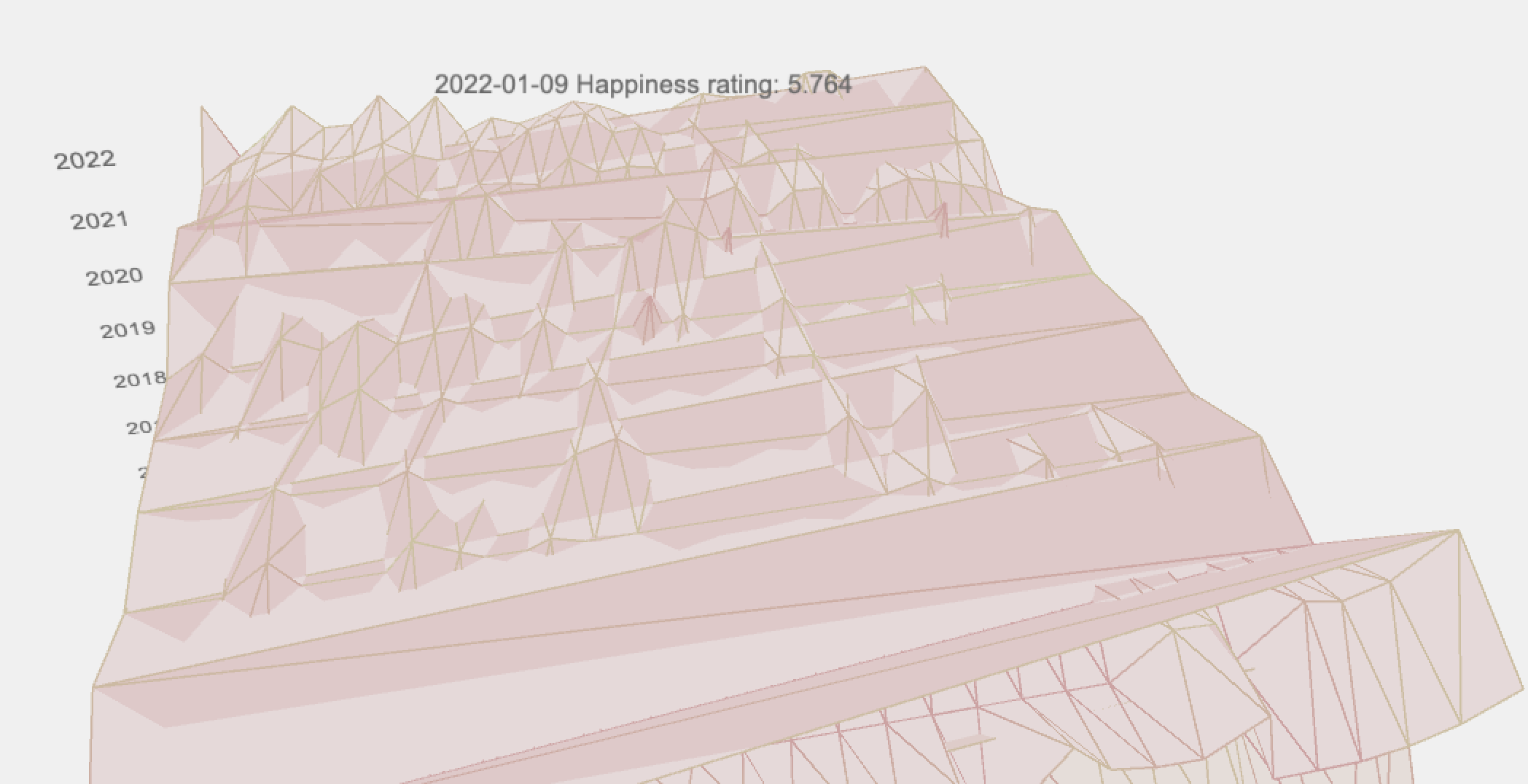
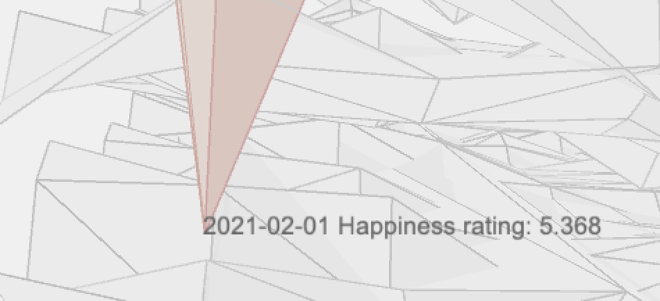
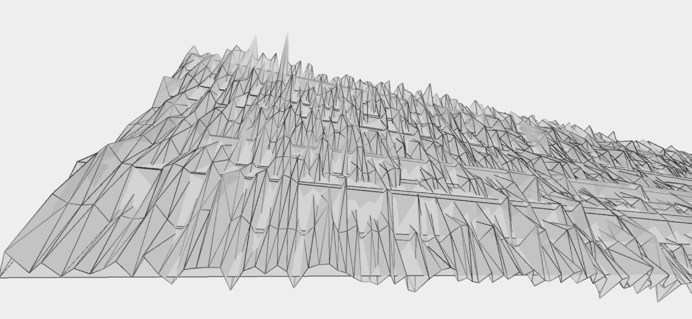
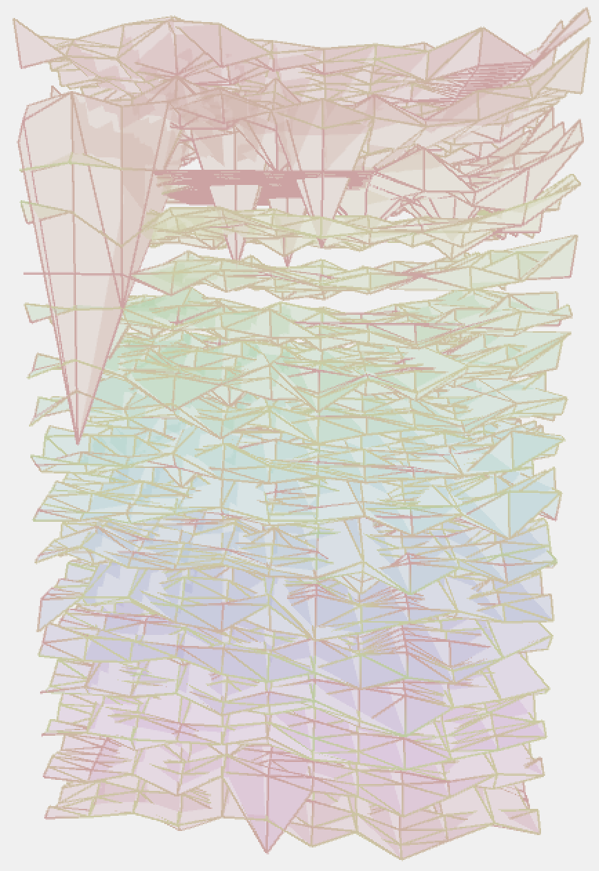
Finally, I turned the data for the previous 17 years into a 3D, interactive visualization using Processing. Each year is visualized as a layer in a stack, which can be isolated and enlarged for easier view. Individual days can be hovered over and give their happiness rating, on a scale of 1 (saddest) to 9 (happiest).
In the final iteration, we can see some inter and intra-year trends. We can see that happiness increases at the end of every year, and is generally lower in the middle of the year. This matches the trends viewed in project 1 for just one year. We can also see the loss of information in 2020 as a result of the Covid-19 pandemic, which results in a flat plane for much of the year.